Thursday, October 20, 2011

Making old photos look good, how to do the Orton effect

This image was processed after the film sat in the fridge for 15 years
Many of us have old pictures that bring back nice memories but the end result was not that great. It could be that the original equipment was not to par or that age has taken its toll on the image.

One cool way to bring back some zest to old photos and making them look good is the Orton effect. This is a technique that involved mixing a very sharp and bright copy with another one that is very blurry and dark of the same image. It was done in the dark room but now reproducing the effect with image editing software is a breeze.

This works with both Photoshop and GIMP.


Step one: Open the image, sharpen it a bit and then go to layers and duplicate the background layer.


Step two: Change the top layer's mode from "normal" to "screen".


Step three: Merge down both layers.


Step four: Go to layers and duplicate the background layer again.


Step five: Go to filters and open the Gaussian Blur tool. This is the tricky part. You need to blur the layer so you can barely see the details in the image. You might want to experiment with that step a few times to get the end result to your taste.


Step six: Change the top layer's mode to "multiply". You can also adjust the intensity of the effect by reducing the opacity of this layer.


Step seven: Flatten Image and you are done.

You can also play with the saturation and sharpen the original image before you start. Save your work as a separate file and compare with the original, you'll be amazed. There are other ways to make old pictures look good, this is a very simple one. The Orton Effect technique can also be used with good pictures, bland ones and even black and white images.

For more examples of what can be done you can check my photoblog here (The last 2 got that treatment) and here.

Thanks for watching.

Gerry :)

Tuesday, October 11, 2011

Cropping your TTV or Through The Viewfinder pictures


One of the interesting style of photography is to take pictures through the viewfinder of older cameras or TTV. Once you have taken your picture you will have to crop it in order to get that 6X6 look. Here's how to do it.


First open your image in your graphic edit program like Gimp or Photoshop.If you picture is not level, simply do select/all, use the select tool in Photoshop to rotate the image until it is level. In Gimp you will select all as well, click on the rotation tool, click on the image and rotate it with the cursor until you are satisfied. You'll then have to click on "rotate" in the dialog box in order for the changes to be set.

Second, use the square select tool and make a square box around the actual image.


Third, crop. In Photoshop go to: image/crop. In Gimp go to: image/crop to selection.


Lastly you might want to flip the image since most viewfinders show a reverse image of the original. You don't have to but if you want here's how to do it. In Photoshop go to: Image/rotate/flip horizontally. In Gimp go to: image/transform/flip horizontally.

That's it you're done.

Have fun.

Gerry :)

Thursday, August 04, 2011

Converting from Photoshop to GIMP

A few months ago Windows fried on me and I couldn't find my Windows XP CD. I happened to have a Ubuntu 10.04 CD lying around and since I had back ups of all my files, I think, I formatted and started a new software adventure.

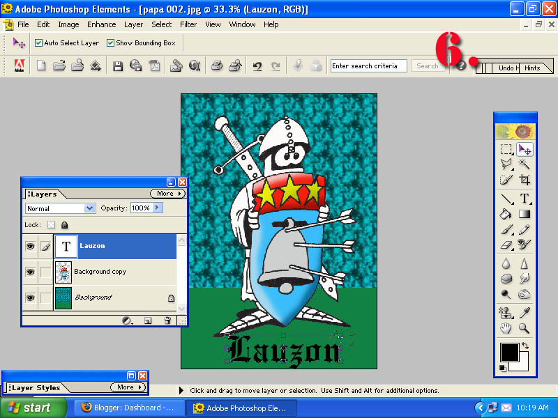
Now I have my Photoshop Elements CD and I could run it with a special plug in inside this Linux software but I had to give GIMP a shot.

The great thing about GIMP, and Ubuntu for that matter, is that it's free. Not only that, but the software is completely vector graphics capable compared to the affordable Elements version of Photoshop and I'll say it again, it's free!

I've been through this process before 15 years ago when I switched from my first photo retouch program (Corel Draw) to Photoshop. I have found that the greatest challenge is to find what is what from the new software compared to the old. This is the exact same experience but it is a lot less painful. There are a lot of similarities between both of them.

I am no software expert but I will share with you what I found out through trial and error and hopefully avoid you the trouble of some frustrating moments as we navigate the waves of change.


The Basics

The first thing you notice is that the toolboxes and the image window are all separate. Where Photoshop is one window with opened image files in them, Gimp opens each image as a Gimp window itself. This means that each image can be used with the file, edit, etc... features within it. The toolbox will be effective to the image sitting on top.

Some of the immediate things you'll need to know in order to survive the transition quickly are as follows:

- Where most controls in PS use ALT to reverse or select like the clone tool, Gimp uses CRTL
- Pasted selections do not become layers automatically, you have to right click in the layer tool box and click on "new layer" before you edit it. Until then it is a "floating selection".
- The font selection sucks big time. You'll have to download a more complete font folder and a font viewer because Gimp as no preview features for fonts. Thankfully there's a lot out there and it's free. Just Google it.
- Putting text into an image will happen in a text box separately. The font size is always small so you probably won't see it. The font size is controlled in the toolbox. Just make it bigger to see it appear.
- There is no "deselect", instead it is called "none" in the select menu.
- When an object or layer is selected with the pointer tool, you can't just resize it, move it or rotate it. There is a separate tool for each of these operations in the toolbox. (Scale, Distort, rotate, etc...)
- Making lines is stupid simple. With any brush, click once at your starting point, hold the SHIFT key, drag the cursor to where you want it and click. Straight line every time. From that point on, every time you hit the SHIFT key it will be in line mode until you go to another tool.
- All the image adjustment features are under "Colours". There's a great white balance correction auto mode in there.
- Adjusting brush size is done in the bottom half of the toolbox under "Scale". The default setting is 1.
- To flatten layers you'll have to go to "Image" where you will find the "flatten image" feature.
- If the layer toolbox vanishes on you, just use CTRL+L and it will re-appear.

That's it for now. I'll have more as I work with it. Until then if you have any special request for me to look into Gimp, just leave me a comment.

Take care

Gerry :)
-

Saturday, December 02, 2006

PHOTOSHOP LAYERS EXPLAINED, HOW-TO, TIPS AND TRICKS, WHATEVER YOU WANT TO CALL IT.


One of the biggest misunderstood feature in Photoshop is layers. It can appear very complicated but once it is explained, you will see that it is not very complicated and very useful. Layers permit you to do all kinds of fantastic stuff to an image.

For this purpose, I'll use a black and white copy of my Norman soldier drawing to illustrate this in a simple fashion.

Before we go off in the juicy stuff, let me give you a definition. Layers are used to give an image different levels on wich to work with. Imagine your image broken up into acetates on a projector. One could be the background, the second one a face and the third one would have some text. That's what layers are.

In photoshop, layers can be rearranged, there opacity modified, they can be copied, merged, locked with each other, created, deleted, you name it. There are two things to look for, the layer button on the top of the program window and the layer "toolbox" in the window.

Let's pic a jpg file in a folder an open it.

1. First step is to make 2 layers of this image. In the layer toolbox you'll notice that you have one layer named "background". Right click in the blue box that says "background" and click on "duplicate layer".

2. Second, now you have two layers. Click in the layer named "background" to select it, go to select/all and click on that. Now press "delete" to erase everything in your background layer.

3. Third step, you deleted the entire background but you still see the image! Your duplicate is on top of that layer and this is what you see. Your background being blank, you can now put stuff in there to show behind the soldier.

4. Fourth, now click in the "background copy" layer box to select it and with the magic wand I selected the white around the soldier to delete it. Even though it's white, it doesn't mean that it's transparent, you have to erase it. Remember that whatever you do happens in the layer that is selected, the one that is highlited in blue. You can also make a layer invisible by clicking on the eye in the box on the left. This helps sometimes, just click in it again for the layer to reappear.

5. Fifth, to drive the point home, I have made a brush stroke in the background layer to show you what the end result is. I will dump all kinds of stuff in that layer to make a background image for my soldier. Look in the background layer box and you will see one straight brush stroke, but in the image you only see what is not hidden by the soldiers layer.

6. Sixth, I've added some text to demonstrate that whenever you paste something or add some text, it automatically creates a new layer on top of the one that is selected. If I would have made the text with the background selected, the letters would have been between the soldier and the background. If you make the mistake, not to worry. Just go to layers/arrange/bring to front and it will go on top of the next layer.

Once you are done with your image, you can save it with all the separate layers in a psd file or you can go to layers/flatten image. This will return your image to one layer and you can save it as a jpg.

Remember to try stuff and make mistakes, lotsa of them. Success is a poor teacher.

Gerry

DEMYSTIFYING PHOTOSHOP OR GENERAL TIPS AND TRICKS


Most newbies to Photoshop, or any other graphic program, are sometimes overwhelmed by the number of options, doodads, bells and whistles that come with it. I agree that it can be very intimidating. It doesn't have to be. The key is in the approach. What you want is to find out what you can make the software do and not what the software does.

I started out with Photoshop 2 many years ago with a 5 minute crash course from my cousin and a background in traditional pen and paper graphic design. I played with it for endless hours without any desire to make anything great, but just have some fun. That's the mindset you should have if you are just starting out with Photoshop or if you have it and never really dared to try it out.

First of all, choose an image that you like and make a copy. Now you can use this image and go nuts. Try everything that is in this program. You cannot do any mistakes. If you don't like what you end up with, just close without saving and start over. Fear of mistakes is the number one enemy of any artist, it prevents talent to shine. Fear is powerful to the point when sometimes you will not even commit the pen to a blank piece of paper. This kills any chance that you have of learning anything.

Second, choose an image that you want to modify, make a copy and go. It can be something simple like removing an ex from a good picture. Just figure it out and do it.

Just remember that when you are satisfied with the results, you have to do like Jesus...and save. Nothing sucks more than loosing an hours work to a power failure. Been there, done that and bought the T-Shirt.

This was not a very technical post, but it is something that everyone should be made aware of before we move along. Anybody that can push a mouse can do Photoshop, it's that simple.

Gerry

p.s. The image was drawn with pen and paper and colored in Photoshop. It just shows you what is possible.

Wednesday, November 29, 2006

PHOTOSHOP CARTOON EFFECT TUTORIAL HOW-TO


I've been playing around for 6 months trying to find a way to render a cartoon effect to my pictures using Photoshop and lately I think that I've come up with something that produces a decent result. Here I will share with you how I do it and feel free to experiment yourself with this technique. On with the show...

First of all, this tutorial uses Photoshop Elements 1 because that's the one I have and the tutorial is possible to accomplish with just about any version of Photoshop, I think.

1. Open an image and duplicate the background into another layer so you have the same picture in two layers. The top one will be the "ink" and the bottom one will be the "color".


2. We'll start by making the "ink" first. Go into filter/blur/smart blur, use the settings in the image I've posted to start and experiment later.


3. After applying this filter, go to filter/sharpen/sharpen edges. This will better define the basic edges of your image.


4. Go to filter/other/highpass and use the settings in the image posted. This will turn the layer into a barely recognisable gray tone image.


5. Go to image/adjustment/threshold, this will turn the layer into a black and white line drwaing of the image. Play with the setting until you are satisfied with what you see. Once that is done, with the magic wand select a white area. Go to select/similar to to select everything white in the image. Press delete and your "ink" layer is done.


6. Now go back and click on your Background layer and go to filter/blur/smart blur and use the same settings as presented in the image. You can also play with the color settings of the background layer after you do this to make the colors brighter.


That's it, you're done. Add some background color, some letters, whatever you want. This is the basic way to do it. The image I chose for the tutorial is not the best one, but it shows that you can do this with just about any image. Bright colors and sharp lines make the best "cartoons".


For more of my stuff, check out my Photoblog: TakingPictures101.

Have fun and don't be afraid to experiment.

Gerry